|
ELECTROMAGNETIC RADIATION This page is a basic introduction to the electromagnetic spectrum sufficient for chemistry students interested in UV-visible absorption spectroscopy. If you are looking for any sort of explanations suitable for physics courses, then I'm afraid this isn't the right place for you. Light as a wave form Waves Any wave is essentially just a way of shifting energy from one place to another - whether the fairly obvious transfer of energy in waves on the sea or in the much more difficult-to-imagine waves in light. In waves on water, the energy is transferred by the movement of water molecules. But a particular water molecule doesn't travel all the way across the Atlantic - or even all the way across a pond. Depending on the depth of the water, water molecules follow a roughly circular path. As they move up to the top of the circle, the wave builds to a crest; as they move down again, you get a trough. The energy is transferred by relatively small local movements in the environment. With water waves it is fairly easy to draw diagrams to show this happening with real molecules. With light it is more difficult. The energy in light travels because of local fluctuating changes in electrical and magnetic fields - hence "electromagnetic" radiation. | |||||||||||||||||
|
Note: It would be quite wrong to pretend that I am comfortable with this. Having spent quite a lot of time looking at web pages which try to explain electromagnetic radiation (or even water waves), do I feel that I really understand it? To be honest - no! Although there are some excellent diagrams and animations out there, I still feel as if this is a foreign land. On old maps, where people didn't know enough about the region they were drawing, they sometimes gave up and wrote "Here be dragons". For me, physics is definitely "Here be dragons" territory. If you are a chemistry student, you don't need to worry too much about this. As long as you are prepared to accept diagrams of wave forms, and can understand the relationships between wavelength, frequency and energy (see below), that's all you need. Please don't e-mail to try to explain all this to me. I'm happy to remain ignorant - life is too short to worry about everything! | |||||||||||||||||
|
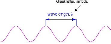
Wavelength, frequency and the speed of light If you draw a beam of light in the form of a wave (without worrying too much about what exactly is causing the wave!), the distance between two crests is called the wavelength of the light. (It could equally well be the distance between two troughs or any other two identical positions on the wave.)
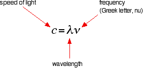
You have to picture these wave crests as moving from left to right. If you counted the number of crests passing a particular point per second, you have the frequency of the light. It is measured in what used to be called "cycles per second", but is now called Hertz, Hz. Cycles per second and Hertz mean exactly the same thing. Orange light, for example, has a frequency of about 5 x 10¹⁴ Hz (often quoted as 5 x 10⁸ MHz - megahertz). That means that 5 x 10¹⁴ wave peaks pass a given point every second. Light has a constant speed through a given substance. For example, it always travels at a speed of approximately 3 x 10⁸ metres per second in a vacuum. This is actually the speed that all electromagnetic radiation travels - not just visible light. There is a simple relationship between the wavelength and frequency of a particular colour of light and the speed of light:
. . . and you can rearrange this to work out the wavelength from a given frequency and vice versa:
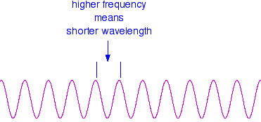
These relationships mean that if you increase the frequency, you must decrease the wavelength.
Compare this diagram with the similar one above. . . . and, of course, the opposite is true. If the wavelength is longer, the frequency is lower. It is really important that you feel comfortable with the relationship between frequency and wavelength. If you are given two figures for the wavelengths of two different colours of light, you need to have an immediate feel for which one has the higher frequency. For example, if you were told that a particular colour of red light had a wavelength of 650 nm, and a green had a wavelength of 540 nm, it is important for you to know which has the higher frequency. (It's the green - a shorter wavelength means a higher frequency. Don't go on until that feels right!) | |||||||||||||||||
|
Note: nm = nanometre = 10-9 metre. | |||||||||||||||||
|
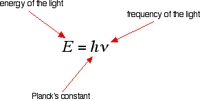
The frequency of light and its energy Each particular frequency of light has a particular energy associated with it, given by another simple equation:
You can see that the higher the frequency, the higher the energy of the light. So . . . have you got this sorted out? Try it! Light which has wavelengths of around 380 - 435 nm is seen as a sequence of violet colours. Various red colours have wavelengths around 625 - 740 nm. Which has the highest energy? The light with the highest energy will be the one with the highest frequency - that will be the one with the smallest wavelength. In other words, violet light at the 380 nm end of its range. The Electromagnetic Spectrum Visible light The diagram shows an approximation to the spectrum of visible light.
| |||||||||||||||||
|
Important: This isn't a real spectrum - it's a made-up drawing. The colours are only an approximation, and so are the wavelengths assigned to them. It doesn't pretend to be accurate! | |||||||||||||||||
|
The main colour regions of the spectrum are approximately:
Don't assume that there is some clear cut-off point between all these colours. In reality, the colours just merge seamlessly into one another - much more seamlessly than in my diagram! | |||||||||||||||||
|
Note: You will find that almost every source you look at for this information gives slightly different wavelengths for the different colours. These values (and the names for the colours) come from the HyperPhysics website. I personally think these are much better names than the traditional "violet, indigo, blue, . . ." - but it really doesn't matter! | |||||||||||||||||
|
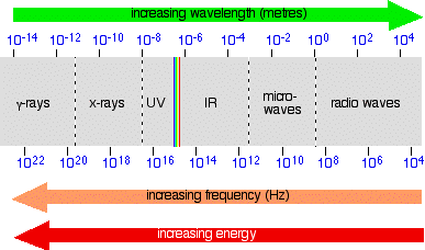
Placing the visible spectrum in the whole electromagnetic spectrum The electromagnetic spectrum doesn't stop with the colours you can see. It is perfectly possible to have wavelengths shorter than violet light or longer than red light. On the spectrum further up the page, I have shown the ultra-violet and the infra-red, but this can be extended even further into x-rays and radio waves, amongst others. The diagram shows the approximate positions of some of these on the spectrum.
Once again, don't worry too much about the exact boundaries between the various sorts of electromagnetic radiation - because there are no boundaries. Just as with visible light, one sort of radiation merges into the next. Just be aware of the general pattern. Also be aware that the energy associated with the various kinds of radiation increases as the frequency increases. | |||||||||||||||||
|
Note: As before, don't take this diagram too literally! It is a composite of several diagrams from different sources, nearly all of which give slightly different boundaries between the different named sorts of radiation. You also mustn't think that this is what the spectrum would actually look like if you were to observe it. The problem lies in the way the scales are drawn. Neither the wavelength nor the frequency scales are simple linear scales - the gap between 102 and 104 is not the same as between 10-2 and 10-4, for example (although they are drawn as the same in the diagram). Work it out! One gap is the difference between 100 and 10,000 (in other words 9,900); the other works out at only 0.0099! That means that in some parts, the spectrum should really be very stretched out, and in others very, very compressed. And because the wavelength and frequency scales are heading in opposite directions, the stretching or compression would be totally different depending on whether you were plotting the spectrum against wavelength or frequency. Does any of this matter for chemistry purposes? No! Think of the last diagram just as a visual way of placing the various types of radiation relative to each other - it is not a picture of what the spectrum actually looks like. | |||||||||||||||||
© Jim Clark 2006 (modified May 2016) |
|||||||||||||||||
